top of page
.png)
YOVO
Role
UI/UX Designer
timeline
3 Months (2023)
team
Marketing team
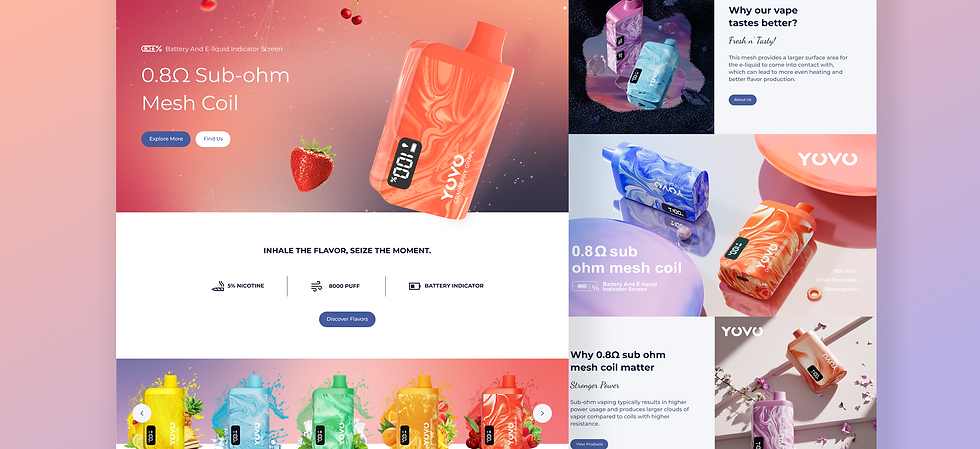
Led a user-centered redesign of YOVO’s product website, improving information discoverability and self-service. Owned research, information architecture, and design execution, delivering MVP features that reduced user friction and support dependency.
Case Summary
26%
increase in organic traffic
73%
REDUCTION IN CLICKS TO CONTACT
Optimizing the Site’s Information Architecture
I led the redesign of YOVO’s product website to improve information accessibility, streamline navigation, and reduce reliance on customer support. Through user research, interviews, and usability testing, I identified key pain points and restructured the site’s information architecture to better match user needs. I owned the design execution from user flows and wireframes to interactive Figma prototypes, collaborating closely with the product team to prioritize MVP features. Key enhancements included clearer product and flavor information, a store locator, and an issue-reporting form, resulting in a more intuitive, self-serve user experience and faster customer support response times.


design principles
I found customers seek fast, guided resolution for product issues, while wholesalers look for a clear and credible pathway to partnership.
63% visitors are customers reporting a product issue while 31% visitors are store owners seeking partnership.

user interviews with yovo customer
01
Insights
Despite steady traffic, the website was not supporting its two primary user goals: post-purchase issue resolution and wholesale partnership discovery. This resulted in user frustration, inefficient support handling, and missed B2B opportunities.
Research Method

old and new sitemap comparison

new user flows

feature prioritization chart
02
From Insight to Strategy
With a clear understanding of user intent, I translated research insights into actionable product decisions through user flows, feature prioritization, and a redesigned sitemap. By mapping core tasks and collaborating with the marketing team to prioritize high impact MVP features, we focused the experience around what users needed most at the moment they needed it. The new sitemap and streamlined flows reduced unnecessary steps, clarified decision paths, and guided users to self serve solutions more efficiently. As a result, user friction was significantly reduced, and the clicks-to-contact rate dropped by removing confusion and answering key questions directly within the experience.
2.png)


bottom of page