top of page
Dakota's
On The
COVE
Role
UX Designer, Branding
timeline
3 Months (2024)
team
Gabriela Marie, Natalie Sesodia, Deby Nouanlasy
Redefining the digital presence of a beloved neighborhood staple. We transformed a disjointed online experience into a warm, community-focused digital hub that drives real business growth.

Case Summary
From Blank Canvas to Launch
A new seafood restaurant in New York set out to establish a strong digital presence, where that could capture its story, express its culinary identity, and support its launch across web and social channels. But without a defined brand foundation or cohesive design system, the restaurant lacked the clarity and consistency needed to build recognition and trust.
The restaurant partnered with our team to create its full digital ecosystem, starting with brand definition and extending through website design, content, and social media assets.
As the brand designer leading this initiative, I shaped the brand from the ground up.
I conducted brand explorations, aligned with stakeholders, and defining the restaurant's positioning, narrative and visual identity. With the brand system established, I collaborated closely with UX designers to translate it into scalable product design outputs, including a detailed style guide, wireframes, high-fidelity prototypes, and all website copywriting through iterative feedback cycles.
I also worked directly with the developer to navigate technical constraints and ensure the final build remained true to the brand vision. To validate the experience, I ran user testing to confirm the site met user needs and communicated with clarity. In the final stage, I extended the brand into social media—designing Instagram templates and partnering with cross-functional teams to deliver a full suite of launch-ready assets.

Demographic Research

Stakeholder Interviews

Competitor Analysis
01
Insights
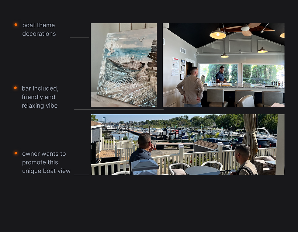
I explored other similar restaurants in the Bronx seafront and identified more opportunities including focusing on unique marina views and local customers. That means we would highlight the overall space, food culture and communities on the website.
Though those insights, I started my brand explorations to identify brand mission, vision and values.
Target audience


brand-to-UI translation
landing page design iterations

Warm Affordable Nautical THEME
VISUAL MOODBOARD

COLOR PALETTE
02
Brand Explorations
Modern, but warm.
To start, I created brand guidelines as a north star of the brand explorations, ensuring consistency across the website and social channels. Brand guidelines maintain consistent visual elements and messaging to reflect the restaurant's unique character.
06
Usability Testing
Iterating based on real user feedback.
80%
task success Rate
97%
satisfaction score
Issue: Value Prop Visibility
Users often overlooked the value proposition when scrolling due to its large font size, making the business type unclear.
Before

After

Issue: Confusing Jargon
Users were confused by the "Dock Menu" label. We renamed it to "Catering Menu" and changed the button hierarchy.
Before

After


business card

business poster card

social media templates

business menu
04
Marketing Asset
I developed a suite of launch-ready marketing assets, including Instagram content, menus, business cards, posters, and promotional materials, to support the brand pre-launch and ensure consistent application of the brand identity across all channels.

05
Seamless Growth
We delivered a cohesive digital presence across the website, social media content, marketing assets, and brand guidelines. With this updated ecosystem, Dakota can more accurately track conversions from online engagement.
bottom of page