top of page

RIVEN
Role
UX Designer / Researcher
timeline
3 Months (2023)
team
Bowei Wang, Tommy Wu, Brooke Parker
I led the UX strategy for Riven’s e-commerce experience, reframing the purchasing journey to help first time visitors move from interest to confident purchase. Through user research, strategic framing, and content exploration, I identified key communication and decision-making gaps that were blocking conversion. I redesigned the site’s core conversion pages, resulting in a measurable lift in conversion and a 25% increase in overall sales.
Case Summary
32%
conversion rate increase
25%
sales increase
53%
add to cart rate increase
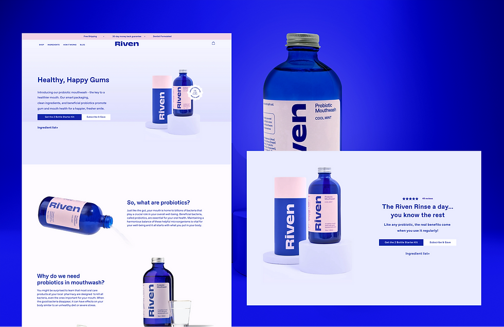
From Browsing to Buying
Riven entered the market as an independent challenger brand, aiming to rethink the traditional mouthwash experience with a unique formula and a modern approach to oral care. But despite growing interest and steady traffic, the brand struggled to convert new visitors on its e-commerce site because the experience wasn’t guiding them toward purchase.
Riven partnered with our UX team to reframe the digital experience and make its value proposition unmistakably clear. As part of the design team, I led user research, strategic framing, and content exploration to clarify the brand’s position and translate its benefits into a user-centered narrative. Through interviews, behavioral insights, and competitive analysis, I identified the core communication gaps that prevented visitors from understanding what made Riven different. Using these insights, I redesigned the site’s key conversion pages, including strengthening hierarchy, clarifying product value, and crafting content that guided users confidently through consideration to purchase.
These improvements resulted in a significant lift in conversion rates and a 25% increase in overall sales, driving meaningful growth for the brand.

Existing riven user interviews

user persona
01
Insights
I initiated the user research phase by designing and distributing a user survey to existing Riven customers, followed by moderated usability testing with 12 active mouthwash users. Through interviews and website walkthroughs, I identified key usability and experience gaps that needed to be addressed to improve clarity, engagement, and overall user satisfaction.
During our user interviews, we discovered two types of people who are interested in probiotic mouthwash: those who have gum issues and are very focused on the ingredients they use, and those who are young and follow trends.

original website
key insights from Usability testing

Design Principles
02
From Insight to Strategy
During the user research, I found out the reason that stop users to check out from the website is not because they were rejecting the product concept, it’s because the unclear decision framing made them hesitating. Based on that, I reframed the problem improving decision clarity.

Communicating Brand Positions
First-time buyers prioritize safety and clarity. Subscription is introduced only after trust is established.

Strengthening the CTA Zone
Grouped price, CTA, and trust signals into a single decision area. This reduces anxiety exactly where hesitation occurs.

Simplifying Purchase Choices
First-time buyers prioritize safety and clarity. Subscription is introduced only after trust is established.

Reframing the Product Offer
This aligned the user’s mental model with the business logic and reframed the minimum purchase as a recommended starting point, not a restriction.

03
Design Solution
Iterating based on real user feedback.


bottom of page